![]()
Posts Categorised: Websites
If you use a plugin called Contact Form 7 Datapicker on your WordPress website, you should immediately deactivate and remove it.
This problem plugin is different from the popular plugin, Contact Form 7 which is not a risk.
Just yesterday, a Cross Site Scripting (XSS) vulnerability was discovered in the Contact Form 7 Datapicker plugin. According to Portswigger Web Security, XSS allows “an attacker to masquerade as a victim user, to carry out any actions that the user is able to perform, and to access any of the user’s data.”
This means the problem plugin can allow an attacker to place malicious code on the website where the plugin is installed. When a user visits the site, the code allows the attacker to impersonate the user – reading any data or carrying out any action the user could see and do, capturing their username and password, defacing the website or even adding malware.
At lowest risk are websites where all the content is public and users don’t have to log in. At higher risk are websites containing sensitive data, such as personal, healthcare and/or banking information. If the compromised user has administrative privileges, the attacker can take full control of the website and any data stored there.
The developers of the plugin are no longer maintaining it so it’s best to deactivate and remove it.
To learn more, go to this Wordfence post.
You can also download a copy of the Wordfence plugin on that site. Both the free and premium versions have built-in XSS protection.
If you have a website for dogs or horses or any kind of livestock or even a genealogy website for your family, here’s how to add a 3-generation pedigree table.
This is what the finished table will look like and it will change automatically to fit the screen size – provided the website it’s on is mobile-responsive.
3-Generation Pedigree Table
| Father | Paternal Grandfather | Paternal Great Grandfather 1 |
| Paternal Great Grandmother 1 | ||
| Paternal Grandmother | Paternal Great Grandfather 2 | |
| Paternal Great Grandmother 2 | ||
| Mother | Maternal Grandfather | Maternal Great Grandfather 1 |
| Maternal Great Grandmother 1 | ||
| Maternal Grandmother | Maternal Great Grandfather 2 | |
| Maternal Great Grandmother 2 |
Editing your pedigree table
To make your own pedigree table, start by opening a plain text editor, such as Notepad in Windows or TextEdit on a Mac. Here’s how to set TextEdit as a plain text editor. Do not use use Microsoft Word or any other text editor that can add styling such as bold, italic, color or different fonts. That additional styling adds code that might break your table.
Copy all the code below and paste it into your text editor and save it as “pedigree.htm.” In Notepad you would add the file name including “.htm” then click on “Save as type” and “All files” in the dropdown box. To make sure everything is working properly, navigate to that file in File Explorer or Finder and double click on it. It should open in your browser.
You may want to make a note of which text corresponds to which ancestor as it can get confusing when you’re working in the code.
Leaving that browser window open, go back to the Notepad/TextEdit file and replace Father, Paternal Grandfather, etc with the correct ancestor. Be VERY careful to only replace that specific text. If you accidentally delete the > or < around the text (or any other code), you'll have to start again. After you've replaced two or three names, click 'Save' then go back to the browser window and click 'Refresh'. You should see the names you've entered. If everything looks good so far, go back to the Notepad/TextEdit file and continue editing. When you're done, save and refresh again. Hopefully everything looks great. If you'd like to add a little styling, such as some names in red or bold you will need to modify the code a bit. It's better to practice on your Notepad/TextEdit file than on a live website. Here's a simple tutorial. I’d suggest using “p style” rather than “h1 style” as h1 is used for your title text and is usually too large for a table. And don’t forget to add the closing tags like “with something inside>” or you could see some unusual changes. Also note that because very few websites are built with plain HTML anymore, your website builder (eg WordPress, Wix, Weebly, Squarespace, etc) may mess with any additional attributes you’ve added.

Other changes to the table itself include the size of the border, padding inside and spacing outside the cells, whether you want the table full width and whether you want it centered. The border generally looks best between 0 to 5. Cellpadding generally looks best with a little spacing to move the text away from the cell border. Cellspacing is used to set space between different table cells.
If you don’t want borders in your table, set Border to “0” and increase the cell spacing to about “20” to put some space between the various names.
The width attribute only applies to the container your table is in. For example, if your table is in a column that is 600 pixels wide, your table will be 600 pixels wide if the width attribute is set to 100%. Try different combinations in the Notepad/TextEdit file, click save and then refresh the browser window to see how it looks.
Adding the table to your website
Once everything looks good, it’s time to add your pedigree table to your website. Each website builder works a little differently, so here’s how to do it using WordPress. If you’re using a different builder, modify these steps using the links below.
Log into your WordPress site, then open or add the page or post where you want to add the pedigree. In the WYSIWYG window, scroll to where you want to add the pedigree table, click Enter to add a paragraph break, followed by several asterisks ****************, followed by another paragraph break. This is to make finding the correct placement in the code easier.
Go to the Notepad/TextEdit file and highlight everything from and including the “CENTER” tag to the closing “CENTER” tag and copy. Do not include the “html”, “head” or “body” tags.
Go back to WordPress and switch to text mode by clicking on the “Text” tab at the upper right of the editing pane.
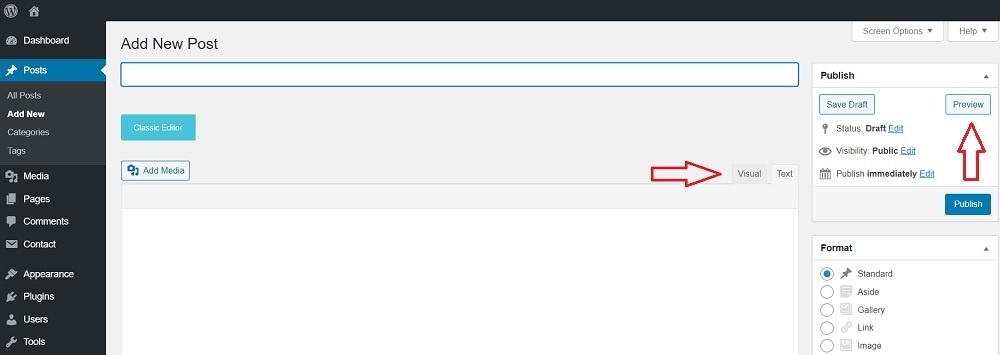
Scroll down to the asterisks **************** you added. Delete the asterisks and paste the code in that place. I like to click the “Preview” button to make sure everything looks right before saving the page for the public to see.
After you’ve added the code and saved the page, check your website to see if everything looks right. If so, congratulations! If not, contact me with any questions.
Adding code in different builders –
Modifying HTML in Wix – https://support.wix.com/en/article/adding-html-code-to-posts-in-the-new-wix-blog
Modifying HTML in Weebly – https://www.hostgator.com/help/article/add-custom-html-to-your-weebly-website
Modifying HTML in Squarespace – https://support.squarespace.com/hc/en-us/articles/205815928-Adding-custom-HTML-CSS-and-JavaScript
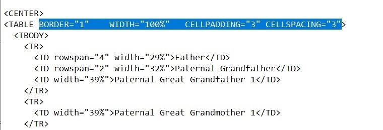
Here is the code to copy:
<html>

<head></head>
<body>
<CENTER>

<TABLE BORDER=”1″ WIDTH=”100%” CELLPADDING=”3″ CELLSPACING=”3″>

<TBODY>

<TR>

<TD rowspan=”4″ width=”29%”>Father</TD>

<TD rowspan=”2″ width=”32%”>Paternal Grandfather</TD>

<TD width=”39%”>Paternal Great Grandfather 1</TD>

</TR>

<TR>

<TD width=”39%”>Paternal Great Grandmother 1</TD>

</TR>

<TR>

<TD rowspan=”2″ width=”32%”>Paternal Grandmother</TD>

<TD width=”39%”>Paternal Great Grandfather 2</TD>

</TR>

<TR>

<TD width=”39%”>Paternal Great Grandmother 2</TD>

</TR>

<TR>

<TD rowspan=”4″ width=”29%”>Mother</TD>

<TD rowspan=”2″ width=”32%”>Maternal Grandfather</TD>

<TD width=”39%”>Maternal Great Grandfather 1</TD>

</TR>

<TR>

<TD width=”39%”>Maternal Great Grandmother 1</TD>

</TR>

<TR>

<TD rowspan=”2″ width=”32%”>Maternal Grandmother</TD>

<TD width=”39%”>Maternal Great Grandfather 2</TD>

</TR>

<TR>

<TD width=”39%”>Maternal Great Grandmother 2</TD>

</TR>

</TBODY>

</TABLE>

</CENTER>
</body>

</html>
If you have trouble copying or the code isn’t showing, you can download a copy of PedigreeTable.pdf then copy from that text.
From contact information and testimonials to mobile-friendly design, there are several features that good websites need.
These features are necessary to compete with the sheer numbers of websites out there. Did you know, there are over a BILLION websites around the world with an additional 500,000 or so added every day?
Maybe you’re thinking it would be easier to just skip having a website. But consumers search the internet for everything and if you’re not there, they will find your competitor. Even having a simple, but well designed, website means they can find YOU instead.
Maybe you’re thinking social media is enough. But consumers say the photos and information disappear too quickly on social media which makes it hard to find. They also say the information is limited, whereas on a website they can see all the info in one place. And they like the structure of a website compared to social media.
There are lots of reasons to have your own website, but it’s important to make sure it’s well-designed and useful. Unfortunately there are many terrible websites – not mobile-friendly, out of date, hard to find important information – it’s enough to scare any potential customers away.
Read on to learn how to avoid those problems.
The 15 key elements your website needs to contain are:
1. A simple web address
2. Who you are and what you offer
3. Easy navigation
4. Good design
5. Mobile-Friendly
6. Quality content
7. Quality images
8. About us page
9. Contact information
10. Testimonials
11. Social media links
12. Optimized for search engines
13. Call to action
14. Opt-in offer
15. Trust signals
Although it sounds like a lot – don’t worry – many overlap.
1. Simple web address
First impressions count so pick a domain name that is descriptive and easy to remember and type. Try to keep it short, but avoid abbreviations.
Although there are lots of new extensions, .com is still the best overall because most people will automatically use it. Other extensions may work if they are actually part of your business name or if you want to spend time and money making your domain name more memorable.
The exception is for non-profits and other organizations who can use .org, but even in that case having both .org and .com would be a good idea.
2. Who you are and what you offer
Have you ever prepared an elevator speech? You know, the 30-second commercial about what you do and how you can benefit your customers just in case you’re ever stuck in an elevator with a nosy person. Well, it is a good idea to develop one because that’s what needs to stand out right at the top of your website’s home page.
Visitors will only spend a few seconds trying to decide whether your website can provide the answer to their search so make it short.
Use plain terms to describe what your company does. Avoid using technical terms. They have their place, but here your visitor won’t spend the time trying to figure out what you mean.
Let them know what your website is about, what content and resources they can find and what products or services you offer. Make sure to include the information users are likely to be looking for.
3. Easy navigation
Make it easy for visitors to find specific content. They’re more likely to spend time on your site if they can find their way around.
Start by organizing your content into sections that make sense to your visitors. A descriptive word about each of these sections should become your links. Use plain English rather than industry-specific jargon for your links and limit the main links to less than seven.
Navigation bars are almost always along the top of every page, sometimes with a smaller sub-bar below it and/or additional links in the footer. Also include links within your content so visitors can learn more. If you can link to another page on your own website, you get bonus points for keeping visitors on your site longer.
You might also consider adding a search box as about a third of your visitors will use it. Helping your visitor find the right information also helps conversions.
4. Good design
Although branding is important, ease of use is more important to your visitors. Your visitors should be able to scan your content to decide whether they found the right content and want to read the full article.
Use plenty of keyword-rich sub-headings, short paragraphs, bullet points and graphics. Also make it visually pleasing with plenty of white space, images and short paragraphs.
Use the same design and color scheme throughout your website and a style that’s consistent with your branding. Visualize the difference between a mortuary website compared to a website for online gaming.
Avoid using more than two or three fonts or colors or your website may be confusing or look amateurish.
By the way, if your website is more than a couple of years old, it may be time to update it. New technologies are available that can make it faster and more user-friendly.
5. Mobile-Friendly
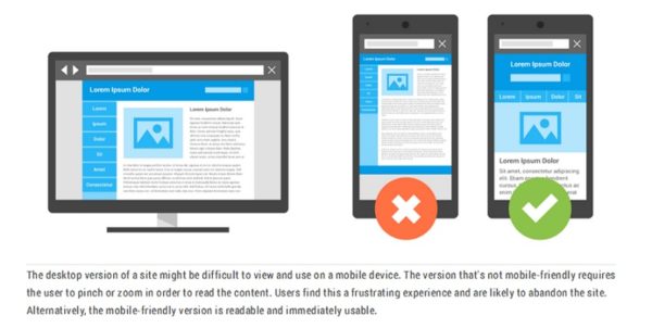
Over half of all web traffic is on mobile and if your website isn’t easy to use on these smaller devices, your visitors will go elsewhere. Although the rest of your visitors might use laptops, desktops and larger devices like TVs, a responsive website can look good on all the various devices.
A responsive website can be easily viewed on the various devices because it can change and adapt to the screen on which it’s being browsed.
Another reason your website should be responsive and mobile friendly is because Google has added it to how they rank websites. That means if your website is hard to see or use on mobile devices it will rank poorly.
6. Quality content
When a visitor comes to your website, they’re looking for something. Give them the best information you can. Your content should be well-written and original and it should also reflect your brand.
But how do you know what to include? Take some time to think about who you’re writing for and what problems they have that you can help solve.
Every article should support the main goal of your website with a clear purpose.
If other people have written about the same topic, how can you write a better article?
Here are a few ideas for a better article:
– Describe recent changes and improvements
– Add examples
– Add images
– Cite your sources
– Describe how you handled a similar problem
Finally, provide useful and relevant content rather than sales pitches.
7. Quality images
Few people are attracted to pages and pages of just text, so include images to show what you do, to personalize your business or to illustrate your point. People often understand better when they can see the solution rather than just reading about it.
But don’t include generic images just to have images. Show quality images of your products or services and perhaps images of your staff and/or your community.
Make sure the images are sized correctly. You don’t want tiny images that visitors strain to see, but you also don’t want huge images that take forever to appear. A good compromise for most images is 1000 pixels on the largest edge. Responsive websites can usually resize images for various devices.
Be sure to check the actual size of your images. Many that are uploaded directly from cell phones have huge file sizes that take a long time to appear on your website even if they look correctly-sized because of the code that makes them appear smaller. There are many websites with this problem.
8. About us page
This is one of the two most important pages on your website. (The other is the testimonials page.) Be sure you give special attention to developing this page.
Add the story of your brand because visitors are more likely to connect with personalized websites. Include names, photos and your business address (or at least your general location). Also include what sets you apart from your competition.
On the other hand, you really need to make it about what you can do for your visitor. So, yes, include a bit of your history, but include what value you bring to your customers.
If that’s a bit tough to imagine, here are some example about us pages to give you ideas.
9. Contact information
Here’s another chance to personalize your brand. Some websites just list their address, phone number and email – somewhere. Maybe it’s at the top of the page or at the bottom of the page or on it’s own page.
Make it easy for visitors to contact you. Too hard and visitors give up and you lose potential sales. The top right part of the header or in the footer are two of the most common places, but why not have a dedicated contact page too?
Give your visitors choices – phone number, address, contact form, even a map to your physical location (and your hours of operation) – plus social icons. But don’t include the details as part of an image. Visitors on a phone want to be able to tap your number to call.
And, yes, include a contact form rather than a clickable email link. Why? To make it as easy as possible for them to contact you. With a form, they can fill it out quickly and click send. A clickable link may or may not open an email provider on your visitor’s device. Once it’s open, they have to copy and paste your email address, write a subject line and a write a message before they can click send. Then you have to hope it lands in your inbox rather than spam.
Also let them know when they can expect an answer.
When you’re designing your contact form, don’t ask for too much. Their name, email address and message is enough to start. The more fields they have to fill out, the more likely they won’t do it. As for the rest, you can ask for more information later. Just start a dialog with them for now.
If you have various departments – such as sales, support and account management – you can include separate buttons for each. When a visitor clicks on one of the buttons, a form pops up that’s specially designed for each department.
You might also include links to your frequently asked questions, whether in a FAQ list or pages that explain warranties, return policies and other information they might need. And then add your contact form for questions they still have.
Other popular ideas are live chats and chat boxes. Common questions can be answered by the bot – even after hours – and if that’s not enough the bot can transfer the visitor to live chat.
10. Testimonials
No matter how great your website and your marketing materials, people will more readily believe customer testimonials. These are people who were like your visitors – reading your marketing message, comparing prices and debating about which product or service to choose. In other words this is someone they can relate to and someone they can believe.
Some websites have testimonials sprinkled throughout their website, usually near the product or service they purchased. Other websites have them on a dedicated testimonial page. And others put them on the home page to ensure they’re easily seen.
Be sure to ask your customers if they would give you their opinion. When they do, ask for permission to use their full names and possibly a photo to establish credibility.
11. Optimized for search engines
Search engine optimization (SEO) doesn’t just apply to the big brands, it’s vital to all websites to get traffic from the search engines.
When someone searches on Google, they rarely – as in NEVER – go beyond the first page of results. They will click on one of the top results that seems mostly likely to answer their search request.
Those top results are based on complicated rules and calculations used to determine websites that have the most relevant answers. And those results are constantly being tested. For example, when more searchers chose the website in the second or third position rather than the first result, the rankings may shift.
So how do you get on the ‘first page of Google’?
Start by analyzing the best key words for your topic. Then use those key words in your title, in your content, in your links, and even in ALT tags. Each page should cover one – and only one – topic and cover it thoroughly.
For example, a plumber in Denver might have a page optimized for ‘plumber in Denver’ and maybe ‘plumber in Aurora’ or ‘plumber in Longmont.’ Or there might be pages based on services, such as ’emergency plumber in Longmont’ or ‘broken pipe in Aurora.’
Choose key words you would like to rank for and thoroughly check the top ten websites. Make notes of what you find and see if you can do better.
Search rankings are also based on how many links are pointing to a website. These inbound leads are likes votes of confidence for that website.
Another ranking factor is page speed. Visitors often don’t wait long for a website to load so speed is important. You can check website speed at https://developers.google.com/speed/docs/insights/rules
There is much more to SEO, but that will give you a start.
12. Social media links
Your website design and esthetics are great. You’ve optimized it to rank well in the search results. Visitors are coming to your website. You have a contact page.
Now what?
Wonder if your visitors aren’t ready to do business with you. Will they remember to come back later?
Just in case, give them some additional options to interact with you such as links to your social media accounts. On social media they can ask questions, see how other people feel about your business and get to know you.
However you should only provide links to accounts where you have an active presence. Don’t include a Facebook account that you haven’t posted on for several months. If you’re active on LinkedIn or Instagram or another social media page, add links to those.
13. Call to action
A call to action (CTA) can nudge your visitor along the path to becoming a customer.
Make it obvious what you want your visitor to do – call now, click here, make an appointment, get a discount, subscribe. Better CTAs are worded to highlight the benefits they will receive. Add a colored button to catch their attention and you’ve shown them what to do next.
There’s an old saying that if you don’t ask, the answer will always be ‘no’ – so be sure to ask.
Along with asking you should let them know what to expect when they click. For example, if they’re signing up for a newsletter, tell them what type of topics it covers and when they will receive it. Also let them know they can opt out, if desired.
You should also give them a reason to take the desired action. Let them know that it will save them money or help them lose weight or get better results.
A simple CTA is to contact you. Better is if you give them an incentive to contact and give you their contact information. It could be signing up for a newsletter or getting a current price sheet or anything that is simple, yet helpful. This is called an opt-in offer which we’ll go over next.
14. Opt-in offer
Another way to stay in touch with visitors who might not be ready to do business with you is an opt-in offer. Basically this is a bribe to get their email address and permission to send them more emails.
Gone are the days when people loved to sign up for more email. Now, they look for any reason to delete emails without having to open them.
To get visitors to sign up, you need to offer them something they will value. And this applies to both your opt-in offer and the following emails. Yes, you can include sales pitches, but they need to be for products or services that your reader wants. Otherwise you’ll lose them as a subscriber – or worse your emails will be reported as spam.
So what makes a good opt-in offer?
– It has to provide a solution to one problem. It’s not about solving all their problems, just targeting a specific problem.
– It needs to be something they can apply immediately.
– It must be consistent with whatever brought them to your website. For example, if they’re interested in losing weight, don’t offer an ebook of dessert recipes.
Once they opt in, continue to engage with them using email which can be set up to deliver automatically.
15. Trust signals
If you collect any personal information from your visitors – even just name and email in a contact form – you should have an SSL certificate and use the HTTPS protocol.
What this means is that the connection between a visitor and your website is encrypted and no one can read that information. You can tell if a website is secure because there will be a lock icon next to the address bar.
If you have an ecommerce website, be sure that you’re also using a trustworthy payment gateway.
Other content you should provide are a terms and conditions page and a privacy policy.
Hurray! You made it through the must-have features for your website, here are 2 bonus features that are good practice even though your visitors won’t notice them – good security and analytics.
16. Good security
Hackers are often sophisticated and use automated programs to attack many websites at the same time. Be security conscious with your website.
Keep your software updated. Most of the updates are to plug known vulnerabilities. If your website uses a variety of themes, plugins and other software, it may feel like a lot of work to keep them up to date, but if you fall behind you may wind up trying to clean a hacked website.
Don’t use default usernames and passwords. That’s like leaving your keys in the car and hoping no one steals it. Your username should be something you can remember, but isn’t obvious like your first initial and last name. Your password needs to be even stronger. Make it at least 8 characters, using both upper and lower case letters, numbers and special characters.
Remove any unused features. If you don’t need it, get rid of it.
Also be sure to back up your website whenever you make changes to your content or when you update software. And don’t keep your backups with your website. If your website is hacked, you may also lose those backups. Instead store them with accounts like Dropbox and Google Play.
16. Analytics
Take the time to set up Google Analytics. If you don’t know where your visitors are coming from, how long they stay, which pages they visit and similar information, you don’t have any way to know if your website is successful or how to make it better.
The next step is designing – or redesigning – your website. These tips can help you get started, but contact us to learn more about how we can help.
There are two main parts of a website: the parts you can see and the parts you can’t.
The parts you can see are pretty easy; you probably just need to know what they’re called. The parts you can’t see might take a little more explaining. Let’s get started…
The Parts Of A Website You Can See
Just like most books have a title page, table of contents and chapters, websites are usually laid out with a certain structure so visitors can find the information that they need.
When you click a link to a website, you land on a PAGE. A website can be many pages or just one. Each page can be divided into a variety of sections.
Before we could browse the web on our phones, websites were one-size-fits-all. The pages were static and usually sized to fit an average-sized desktop monitor. If you keep that in mind, why some parts are named as they are will make more sense.
On a website you might see:
- a header
- a navigation menu
- the body
- a sidebar
- a footer
The HEADER is at the top of the page. Makes sense, right? Some are pretty big and contain a lot of information. Others are so small they can barely be called headers.
The larger headers might contain a logo, navigation menu, tagline, phone number, address, search box, social media icons, account login and/or an opt-in box.
On a phone or tablet, this information will usually display differently.
Some headers are ‘sticky’ which means they stay at the top of your screen as you scroll down. Others scroll out of sight. When they scroll there is often an arrow or caret facing up that is a link to the top of the page.
Another item you might see in the header is a ‘slider’ or image carousel. They contain images or videos that slide in and out and might include text or buttons on top of the images. Sometimes they move too fast to read all the text. If that happens, try hovering over the image to pause it. Clicking will often take you to another page.
Usually directly below the HEADER is the NAVIGATION MENU. Some website have a vertical menu on the left side. Occasionally there will be a secondary menu below the main menu or at the bottom of the page.
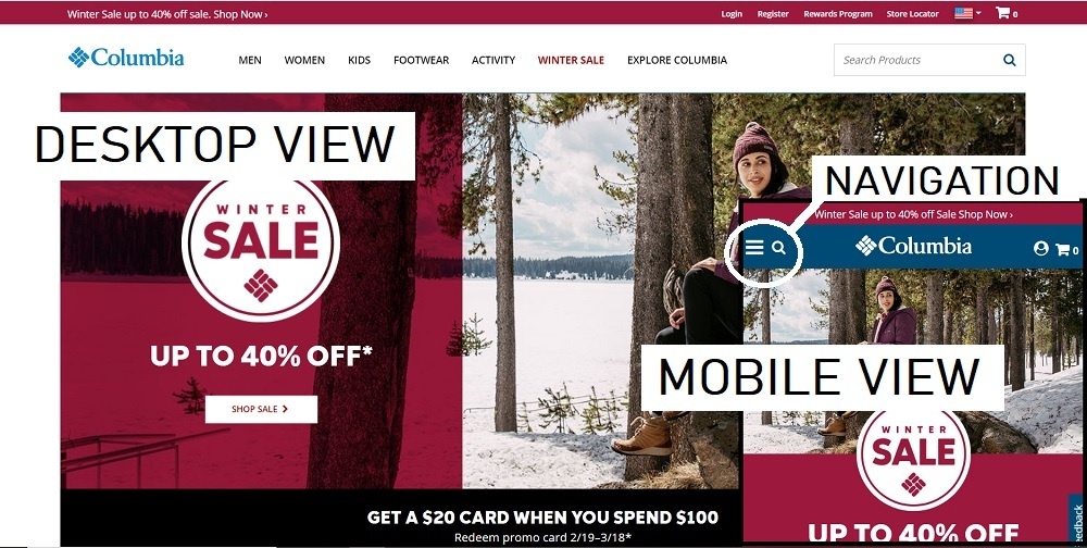
On a phone or tablet, the menu will often be replaced by 3 horizontal lines. When you click on that, you’ll see a vertical menu. Good thing because the menu links can seem pretty small on old websites. (NOTE: You can see these lines labeled ‘Navigation’ in the Columbia image above)
As a side note, the newer websites are called ‘responsive’ because they respond to the size of the user’s device. If you’re on a laptop or bigger device, you can grab the side of your browser window and drag it to make the window smaller. A responsive website will change right before your eyes. The older websites that aren’t responsive or mobile-friendly can be very hard to see and even harder to navigate on a phone.
Continuing down, the next part you’ll see is the BODY or CONTENT AREA. Sometimes it’s just text. Sometimes it also has images. Sometimes it’s one large area and other times it’s broken into smaller blocks. This is where the main content for that page goes. By the way, each page should focus on one idea or theme. For example, if you have a stud dog you should have one main page about just that dog. You might have a page that shows all your dogs with links to individual dog’s pages or you might have a secondary page that shows the dog’s puppies, but there should be one page that highlights each dog.
In the text there are often links that guide users to more information. Some links are ‘external’ in that they go to a different website while others are ‘internal’ and direct users to other pages within the same website.
There may also be a SIDEBAR. Sometimes it’s on the left, but more often it’s on the right when you’re browsing on a computer. On a phone or tablet, that ‘sidebar’ will usually move below the main content. You may not even notice that it’s a different type of content when you’re browsing on a phone.
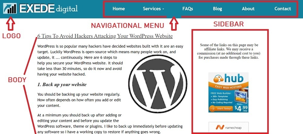
Often the SIDEBAR will have an opt-in form, a call to action such as ‘Request a quote’ or ‘Contact Us’ plus links to popular posts, social media links and maybe a brief ‘About us’ section. Each website might use the section a bit differently, but usually it will be the same throughout the website or a portion of the website.
At the bottom of the page is the FOOTER. Like the header, they can be very simple – just the copyright notice – or they can include everything but the kitchen sink. The best websites fall somewhere in between. They might include basic contact information (or a ‘contact us’ form), social media icons, additional secondary links (such as to a Privacy Policy), a search box, a small map or whatever information would be helpful. Usually the footer remains the same throughout the website.
The Parts Of A Website You Can’t See Or Barely Notice
Let’s start with the website’s URL (‘Uniform Resource Locator’). Just like every building has a street address, every website has a URL.
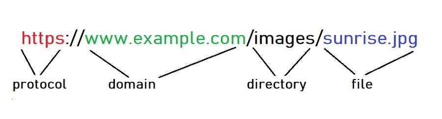
Most start with ‘http://’ (or ‘https://’ for a secure connection). This is the protocol or rules about how data is transferred over the internet.
Next is the domain name – www.example.com – for the website you want to visit. Special computers convert those words into a series of numbers called the ‘IP address’ and then send your request to the computer at that address.
That computer then looks in the directory – images – and finds the file – sunrise.jpg – then sends it to your computer or phone to display.
Another part you can’t see is the website CODE. These are instructions telling your browser what to display.
Here’s how to view the code:
On a PC running the Chrome browser –
- Right-click the page.
- Click View page source.
- The source code will show in a new tab in the browser.
On a Mac running Safari –
- Click on Safari menu > Preferences > Advanced.
- Check “Show Develop menu in menu bar”.
- Close the Preferences window.
- Go to the Develop menu > Show Page Source.
On an Android running Chrome –
- Open the Google Chrome Internet browser.
- Open the web page.
- Tap once in the address bar and then move the cursor to the front of the URL.
- Type view-source: and press Enter or Go.
On an iPhone/iPad running Safari –
- Go to Settings > Safari and check ‘Enable Web Inspector’
- Open up Safari and go to the page you want to inspect
- Plug your device into your computer and open up Safari on your desktop.
- Go to Develop > Your iPad/iPhone Device > the tab you want to inspect.
That code is quite a bit more sophisticated than plain HTML that I wrote in Notepad to build websites many years ago. If you’d like to try using HTML to make a simple page showing a table, go to Add A 3-Generation Pedigree Table To Your Website.
By the way, there are other little bits of code that websites use to learn more about you when you visit. They’re called PIXELS and COOKIES.
Pixels allow a third party to track user behavior. Say you’re thinking about buying a BMW car and visit their website to see what’s available, then the next day your Facebook page is showing you ads for BMWs. That’s because you triggered a pixel on the BMW website. (Just an example. I don’t know whether BMW uses pixels or not.)
Cookies store information in your browser so the server can read it later. For example, the first time you used Facebook you had to provide information such as a user name and a password, but you don’t have to do that anymore. That’s because the Facebook website reads the cookie in your browser and knows it’s you so you don’t have to remember all your login information. Although it can seem somewhat intrusive at times, neither collect personally identifiable information.
Now you know a bit more about websites and the internet. You can even speak ‘web design.’ Let me know if you have any questions.
How fast your website loads is important if you want other people to see it.
Why? Every second your customers are delayed waiting for your site to load – you’re losing money.
According to Neil Patel, “If an e-commerce site is making $100,000 per day, a 1 second page delay could potentially cost you $2.5 million in lost sales every year”.
“2 seconds is the threshold for ecommerce website acceptability. At Google, we aim for under a half second.”
Maile Ohye, Google
One – two – three.
If your site hasn’t loaded in that amount of time, your visitor is gone. Probably never to come back.
Another problem with a slow loading site is search engine ranking.
Google checks about 200 different factors to determine where your site will rank for a particular key word or phrase. If you’re the only veterinarian in Anytown, USA then Google doesn’t have much choice. If someone searches for “veterinarian in Anytown, USA” your site will show up (probably).
But if your business is one of many similar businesses in the area, you need to do more to rank well in the search results. Page speed is one of the most important factors.
“Although speed has been used in ranking for some time, that signal was focused on desktop searches. Today we’re announcing that … page speed will be a ranking factor for mobile searches.”
Your options –
Okay, you just checked your own website and it seems to load pretty fast, so what’s the big deal? Well you’ve probably checked your website before and some of it is cached on your computer or phone. That means it didn’t have to download those pieces before it could start displaying the website. Someone new to your website doesn’t have that cache, so you’d better hope they have patience.
Your other option is taking the time to optimize your website. There is an updated tool that can help you determine what to do.
Here are some things you can check with Google’s tool:
- The speed of both the entire site and of individual pages
- Whether the site/page speed is faster or slower compared to the prior month
- Whether the site speed/page speed ranks Fast, Average, or Slow
- How the site speed compares to others in the industry
- The potential impact of site speed on revenue
- A detailed list of recommended fixes to increase speed on up to 5 pages on the site
Go check your website now at: https://www.thinkwithgoogle.com/feature/testmysite
Give us a call for help in speeding up your site if you get a poor grade – and especially if you get an “F” (gasp!).
Whether you’re just starting out or building your own blog network, you need to find quality hosting that gives you the best value.
Some things to check include:
- Reliability – Servers can crash and if your files are on that server your website disappears. Most hosting providers have redundant servers that mirror each other so if one goes down the other will still have your website available. You can also check for an uptime guarantee. If they’re dependable, they should guarantee at least 95% uptime.
- Support – When something goes wrong, who can you contact? Do they have 24/7 free support? Some may offer support via phone, while most use a chat feature. Many web hosts outsource their support function overseas. That’s great when you need help after local business hours, but it can sometimes be difficult to understand an agent who is not a native speaker.
- Backup – Check how often they backup and how difficult it is to restore your website.
- Platform – Check whether they support your type of website, for example WordPress files. Most do, but not all.
- Shared hosting – It’s less expensive, but if there is trouble with one of the other sites on the server it can affect all the sites. Another option is a Virtual Private Server (VPS) which is a higher quality web server with faster response time, however be prepared to pay more, lots more. Many VPS start at $40 per month.
- Space for your files – Most offer more than enough space for a small- to medium-sized website.
- Bandwidth – This is the amount of data that can be carried from one point to another. Some hosts limit the amount of bandwidth your website can use in a month. If you exceed it, they temporarily shut down your site. Unlimited bandwidth is a better choice if you will have many visitors, however it generally costs a bit more.
- What is included – Some hosting companies give you just that, hosting. If you want email too, you pay extra. Some will include a free domain name, but make sure you can keep it if you decide to move your website later.
- Options as you grow – As your website grows you may need more services or space, so find out if they can scale with you.
- Exit strategy – If you decide to move to another host sometime in the future, how difficult will that be?
For me, I want unlimited space and unlimited bandwidth. Technology has come down so far in price, there is no reason not to have unlimited. I also expect the full monty – space, bandwidth, cPanel, email, support and one-click WordPress installation.
I found one host that meets all my criteria and then some. I’ve been with them for several years and have multiple websites hosted on their servers. If you want to use the same host, click here. That is an affiliate link, which means if you buy their hosting I will get a small commission however that doesn’t affect the price you pay at all.
You’ve probably seen a bunch of privacy policy update notices and websites proclaiming they use cookies and wondered what changed.
It all has to do with GDPR. Maybe you’ve heard of it?
If not, you should learn about it if you do any business online or even if you just have a website. You may be at risk. Read on to find out why.
What is it?
GDPR stands for General Data Protection Regulation which is a data privacy law enacted by the European Union.
Don’t stop reading because you think it doesn’t apply to you – because it will affect people around the world, not just in Europe.
Here it is in a nutshell:
* It will affect anyone who handles personal data such as names and emails (in addition to other kinds of individually identifiable information) of EU citizens.
* It adds new obligations for anyone who processes that data and makes them responsible for the safety of the information and accountable for the way it’s used.
* It applies to ANYONE who collects personal data; not just businesses.
* The fines for non-compliance are huge – up to $24 MILLION or 4% of GLOBAL revenue (whichever is higher).
So it’s pretty wide-ranging, could easily apply to you and the penalties for non-compliance are astronomical.
Let’s go a little deeper into just what it does.
Basics of the GDPR
It tightens EU laws about what you can do with someone else’s personal data and it gives that person more control over how their data is collected and used.
But what is “personal data”? It’s anything that can identify them. That includes name, address, email, user name and even the IP address their computer uses when they’re online.
Companies and websites that collect personal data have to ask for permission more often and have to be more careful about how that data is shared. It might surprise you how often data is shared – for example, it could be shared to an email provider or for analytics or for tracking advertising. Have you ever looked at a product online and then saw the same thing in your Facebook feed? If it seemed like you were being followed, you kinda were.
Anyone or any company that processes personal data has to be able to explain why they need it and what they’re doing with it.
If you have an opt-in form on your website, be sure to explain how you will be using that person’s email. Compare “Receive this free report.” with “Receive tips and recipes directly to your in box, starting with this special report on how to reduce your dependence on insulin injections.” With the first example, they’ve given you permission to send the report and nothing else. In the second example, you can also add them to your mailing list.
Data collected should also be limited to what is required to achieve the stated objective. In the above opt-in form you could ask for an email address and possibly their name. Asking for the person’s age, gender and phone number in addition is excessive.
Sometimes there is a legitimate interest to collect data without asking for consent. In such cases, openness and transparency about what data is collected and how it’s processed will help it be a fair use.
You should have a privacy policy that describes what data you collect. For example, you might use temporary cookies to analyze how visitors use your website or collect IP addresses to prevent fraud. This should be spelled out in your privacy policy.
Once data is collected, it must be kept accurate and up-to-date. Whether someone contacts you to update their email or you get regular bounce backs, you should take reasonable steps to update that data.
The data must also be kept secure.
Will the GDPR affect you?
The GDPR is designed to protect consumers in the EU. It doesn’t matter where the person who collects their data is based. If they can give you their data in any way, you need to be compliant.
It doesn’t matter whether or not you offer anything for sale to someone in the EU. The important point is whether you are a “Data Controller” – which is someone who decides:
* to collect data,
* what kind of data is collected and
* why it’s collected.
If you have a website, you may not even realize you are a “Data Controller.”
You could, for example:
* Use Google Analytics to understand how visitors are using your website.
* Enable the Facebook pixel to track page views and show targeted ads to visitors when they log into Facebook.
* Collect email addresses. It may be to send a newsletter or updates. Or it could be in exchange for a piece of content or a small item, with the intent to send other emails in future (often in an autoresponder with occasional sales pitches).
* Have a website built with WordPress or another Content Management System. With blog comments enabled, the software will require commenters to register using their names and email addresses before they can comment. The software will set cookies when they register or login. There may also be plugins that collect personal data.
* Have a hosting company that tracks visitor’s IP addresses which is a good thing because it can protect websites from hackers. However the GDPR considers IP addresses as personal data.
* Provide a service – and even blogging is considered a “service” because it’s providing information.
Do you do any of those things? If so, you could be subject to the GDPR – and the enormous fines for non-compliance.
What should you do?
First, determine if you are at risk and whether you want to take proactive steps to protect yourself or wait and see how the regulation will be interpreted. Which you choose depends on how clearly you fall within the regulations and your tolerance for risk.
Another option is to take some basic steps and then make revisions and additions as more information becomes available.
Because the regulation protects people of the EU specifically, you could block any traffic from there. That might be an option for a local business, such as a plumber who only works in Chicago.
If you’re not just local, blocking might not be a good idea as 25% of all website traffic comes from Europe.
If you decide to take proactive steps, first determine what data you collect. The most obvious would be the names and emails via contact and optin forms. But don’t forget data collected by systems such as Google Analytics, Facebook pixels, WordPress (or other CMS) and any plugins.
Also determine the minimum data you need to collect and stop collecting anything above that. If you can’t justify collecting something, don’t ask for it.
Check your security:
* Make sure any login credentials are kept private.
* Use strong usernames and passwords.
* Use reputable plugins.
* Keep all forms of data storage (eg external hard drives) protected physically.
* Make notes of how you secure any data you process.
Also check with your hosting company to see what security processes they have in place. Get a written statement from them that they are GDPR-compliant.
Next publish a privacy policy that outlines the types of data you collect, how you intend to use it and how it might be shared. Outline what visitors are consenting to, how they can withdraw their consent, how they can access that data and the steps they need to take under the “right to be forgotten.” The policy also needs to cover what you do to keep that data secure so get your notes out.
Even if the GDPR doesn’t apply to you, it would be wise to start taking steps to protect the personal data of all of your visitors. It not only makes good sense, but I wouldn’t be surprised to see other similar regulations spread throughout the world soon.
Contact us if you need some help making your website compliant with GDPR.
Europe countries map 2.png derivative by San Jose, used under CC BY-SA 3.0 / Text added
Disclaimer: This post is for informational purposes only, and you should not consider it legal advice. We recommend that you seek legal and other professional counsel to determine exactly how the GDPR might apply to you.
With the popularity of smart phones, most consumers are going online to find businesses that suit their needs.
And 75% of those consumers are going to make a decision – usually within a few seconds – about whether your business can meet their needs.
Do you know what they’re using to base their decision?
Your web design.
The color, the layout, the use of white space all factor into a quick, subconscious decision whether to stick around long enough to read your text.
Surprised?
Let’s take a look to see what might cause those consumers to bounce right off your website like a beach ball at a concert.
What Do Users See First?
Eye tracking studies show there are certain places visitors scan first – usually across the top and down the left side. Then, if it interests them, they will skim more of the page and click on content that catches their attention.
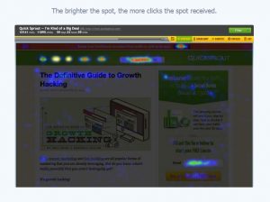
Image courtesy CrazyEgg.com
Where most people look when they first visit your website, is exactly where YOU should put your most important message and images.
And don’t be coy or cute. Visitors aren’t going to stick around to figure out what you mean. Make it clear what your website is about.
Action Steps:
Open your most important pages, one at a time. Now squint. What do you see? If the important information doesn’t jump out at you, you need to update your page. Place that information in the hot spot areas and make it stand out.
Be sure to check out Crazy Egg and also try the Five Second Test to see how real people evaluate your website – in the first few seconds.
Does Your Website Look Outdated?
Does your website still have a visitor counter or guestbook? Does it need a splash screen? Does it use Flash?
These features may have been fun or useful 20 years ago, but now they just make your website look outdated or even amateurish. And they may negatively affect user experience.
Hopefully there aren’t any websites that still use blinking text in rainbow colors or mouse trails. Neither were fun or useful.
Here are more reasons some websites suck:
- green text on a black background,
- few, if any, links after leaving the home page,
- huge picture file sizes,
- pages that take forever to load,
- having to scroll sideways,
- having to scroll down and down and down and down,
- typos,
- audio and/or video that starts automatically,
- poor content.
Action Steps:
Update your website with a fresh, clean look.
Avoid placing text over an image or textured background. Also avoid using a reverse color scheme where there is a dark background and light text. It’s usually more important that visitors are able to read your text easily than it is to look too trendy.
Use plenty of white space to give your content some ‘breathing’ room. Break up your paragraphs into 1 or 2 sentences each. Add images and other graphics to add interest and convey your message more clearly.
Choose an easy-to-read font with sufficient size. Twelve pixels is about the smallest size to use and still be readable on a variety of screens. Avoid most curly, script and odd fonts because they can be hard to read. One exception might be to use one of these types of fonts as a design element in your logo.
Check the size of your images. Unless it’s a featured image, it shouldn’t be more than 800-1000 pixels on the long side. Most PC computers come with a free program called ‘Paint’ that can help you crop or just resize overly large images.
Don’t try to do everything on one page. Break your content into reasonable chunks and make use of categories and subcategories. For example, a roofing company might have links to Home, Commercial Roofing, Residential Roofing, About Us and Contact Us. Then there could be subcategories for specific types of roofs and/or service areas.
And make sure your website doesn’t have any of the sucky problems listed above!
Is Your Website Mobile-Friendly?
Because so many people browse the web using a mobile device, an old, static website is going to be difficult – or even impossible – for them to see.
If you get them to visit and they have a poor experience, they won’t come back.
Ever.
Some problems visitors might encounter on a website that isn’t mobile-friendly are:
- Having to pinch and zoom to read text,
- having to tap on links that are too-small on mobile devices,
- slow load times,
- videos that don’t play on mobile devices (Flash is particularly bad).
Google has been pushing for mobile-friendly websites since 2013 and made it a part of their algorithm in April 2015. Websites that are not mobile-friendly rank poorly in mobile searches. And because so many people are using their mobile devices to access the Internet, they may never find your website.
Action Steps:
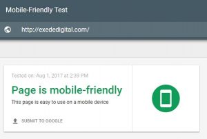
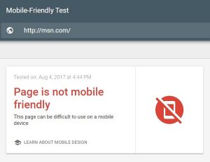
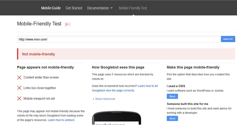
Use Google’s Mobile-Friendly test to check your website. Be sure to test your home page AND any other important pages. Sometimes the home page will pass because it doesn’t have much text, which could mislead you to think that your entire website is fine.
If your website doesn’t pass, is it worth trying to update it using old technology or should you ditch that old, static website? Remember, your advertising dollars are wasted if you’re sending potential customers to an outdated, not-mobile-friendly website.
If your website is huge and it’s not cost effective to change right now, consider updating the front page and then set up a separate mobile-only website. This website will have just the basic information a visitor needs – what you sell, where you’re located, how to get in touch with you, etc. It’s the façade of your business. Once you have this mobile-only site, you need to link it to more information on your old website.
In all other cases, build a new, mobile-friendly website. I’d suggest a responsive design because it will show well no matter what size screen your visitors use. It automatically recognizes the type of device used to view it, then rearranges and resizes itself to provide a good experience for visitors. It’s also Google’s preferred format.
What Makes A Good Website?
So your website is well-designed, looks up-to-date and is mobile-friendly, but it may still fail if you haven’t designed it for your targeted customer.
If you were shopping for a new luxury car, would you trust a website that looks and sounds like it was designed by a teenager?
Probably not.
Take a look at your website. Would the graphics and content appeal to your targeted audience? If not, you should redesign it.
Action Steps:
Start by asking your current customers what they would like to see on your website.
Look for online forums where your ideal customers hang out and check for the questions they’re asking. Make sure your content answers those questions.
When someone visits your home page, make it clear what they should do next. You could give them a choice, but no more than 3 or 4 so it doesn’t get confusing for them.
Write your content at – or slightly below – the education level of your target audience. Don’t talk down to them, but make it easy to read.
Include a call-to-action on every page. Call now for a quote. Sign up for our newsletter. Visit one of our locations today.
Can Visitors Find Your Website?
Some people think it’s enough to have a website, but it won’t do any good if no one sees it. There are over a BILLION websites on the web, so you need to do some extra work to make sure your customers and potential customers can find you.
Some common misconceptions about search results:
- Search results are alphabetized. No, they’re not. Google looks at 200 factors about every website to find the best answer to the user’s search terms. If you were the only dentist in Anytown (population: 100), you would probably show up at the top of the search results for ‘dentist in Anytown.’ But what if your practice is located in a town where there are 30 dentists, plus 20 more in the surrounding towns? Just got a little tougher, didn’t it?
- People know my website address, so I don’t need to do any of that SEO mumbo-jumbo. It’s great that your customers are aware of your address, but don’t you want new customers too? People are using Google Search to find what they want and if your website isn’t optimized to rank high in the search results, they’re probably going to go to your competition.
- I don’t have to do anything because my website is already at the top of page 2. Unfortunately you probably won’t get much – if any – traffic from the search results because 91% of searchers NEVER go beyond page 1 and over half of searchers will never look past the top 3 results.
- My website is in the top 3 for my search terms, so I don’t have to do anything more. Awesome! But what about other key words potential customers might use? Whatever you sell, there’s sure to be several ways people might describe it.
- My home page already has hundreds of search terms. I don’t need to add any more. Unless your home page is humongous, it shouldn’t have hundreds of key words. Your home page should act as an introduction to your business and a sign post to more information. There should be separate pages for each of your major key words so if a visitor is searching for ‘blue widgets’, he doesn’t have to wade through information about ‘green widgets’ and ‘red widgets’ and ‘rainbow-colored widgets.’
You know who else is checking out your web design? Google and other search engines are using new technology to decide whether a site looks good or not. It may not be a factor in your search rankings – yet – but it’s definitely something to consider.
Action steps:
Decide which key words you want to use in your website. Each page should be different – similar, but different.
If it’s got too much competition, you might try some other key words or consider using long-tail keywords. For example, if you sell computers instead of trying to rank for ‘laptops for sale’ niche it down to ‘Dell Inspiron 5000 laptop for sale.’ It is more targeted and will have less competition.
If you service a local area, use the name of your area (and maybe surrounding areas too) in your key words. For example, ‘plumber serving Denver CO.’ Another page could use ‘plumber in Parker CO.’
Once you’ve decided on your key words, use them on that page. Include them in the title, in the first paragraph and in the ALT tag on a graphic.
You can also use words that would be found naturally with your key words. For example, a plumber might also use words and phrases like ‘stopped up drain’ or ‘broken pipe.’
Provide quality information and don’t overdo the use of your keywords. Your text should sound natural if you were to read it out loud. Also make sure the text is relevant to your key words. Your visitors won’t be happy if they go to your page expecting to find information about one thing, but your text is about something different.
There is a LOT to Search Engine Optimization. Much more than we can put in short actions steps, but using key words properly will get you started. Be watching our website for a complete update of our post Complete Beginner’s Guide to SEO. It will be available in a couple of weeks.
Thanks for reading! I hope this post has helped you decide whether your website is working. And if not, what you need to do to make it better.
If you decide to do-it-yourself or ‘hire’ your neighbor’s kid, it needs to be done right. Sometimes DIY works just fine, but unless you are familiar with all the recent updates available you may need another redesign soon.
Or you could go with a ‘do-it-for-me’ website design professional who will make sure it’s done right the first time.
Remember your website is one of your best sales tools. Make sure you keep it up-dated, optimized and looking good!
Contact us now to find out about getting your new professional website.
WordPress is so popular many hackers have decided websites built with it are an easy target. Luckily WordPress is open-source which means many people work on, and update, it … continuously.
Here are 6 steps to help you secure your WordPress website. It should take less than 30 minutes, so do it now and avoid having your website hacked.
1. Back up your website
You should be backing up your website regularly. How often depends on how often you add or edit your content.
At a minimum you should back up after adding or editing your content and before you update the WordPress software, theme or plugins. I like to back up immediately before updating any software so I have a working copy to restore if anything goes wrong.
Be sure to store your backup copies away from your website. It wouldn’t help very much if your website gets hacked and your backups are also affected.
Some hosting companies provide backup services or you can install a back up plugin. I like All-In-One WP Migration because it’s easy to use and can backup your entire website, including content, databases and settings.
2. Remove old WordPress installations and backups
If you’ve set up a practice WordPress installation or saved your backup files on your hosting account, you should remove them. Other software you may have installed, but aren’t using, includes Drupal and Joomla.
Any files that aren’t being maintained and updated can be a doorway to hackers.
You can get to these files and folders using cPanel, if it’s provided by your hosting company. After logging in, scroll down to link called ‘File Manager’ or something similar. By clicking on it you should see the files and folders within your hosting account. If you don’t have access to cPanel, you can access the files using an FTP program.
If you don’t have an FTP program, download a free copy of FileZilla.
If you’re not sure what might need to be deleted, contact your hosting company for help.
And be sure to make a backup of your website before deleting anything. Just in case!
3. Secure your cPanel and admin accounts
While you are in the cPanel, update your cPanel password. Don’t use something generic or easy to guess, such as your address or birthday. Try for at least 8 characters (20 is better) and use both upper and lower case, plus numbers, punctuation and special characters. Keep your password somewhere safe.
By the way, if you like playing the fun little quizzes on Facebook, be careful of giving out too much personal information. Answering harmless seeming questions like ‘what’s the name of your first pet?’, or ‘where did you grow up?’ or ‘what was your first car?’ or ‘what was your mom’s maiden name?’ can give hackers the tools they need to get into your website and even your bank account.
Next log into the WordPress dashboard by going to yourdomain.com/wp-admin/ (substitute your actual domain name for ‘yourdomain’) and enter your username and password. Go to Users > All Users and check all the ‘Administrator’ accounts. Delete any you don’t recognize. If the passwords on the remaining accounts are weak, update them as above. Notify your administrators of the change.
4. Delete all themes and plugins you don’t need
WordPress generally comes with several themes and plugins already installed. For themes, go to Appearance > Themes and for plugins go to Plugins > Installed Plugins. Delete any that you’re not using or that you don’t recognize.
Check the remaining theme and plugins for the most recent update version. You will need to click on the author’s link for your theme and the ‘Visit plugin site’ link for each plugin to check.
If there are some that haven’t been updated within the last year or two, you should find a replacement and delete the old one. Old code can hide vulnerabilities. Another option is to contact the author and ask why it hasn’t been updated recently.
5. Update your WordPress installation, theme and plugins
If you haven’t made a backup already, do so now.
If your WordPress installation, theme and/or plugins are not up-to-date, update them. Check after each update that nothing was broken.
If there are any problems, restore from your backup and try again, deactivating one plugin at a time to find which one is causing the problem. You may need to contact the author of any theme or plugin that causes a problem.
6. Add security software
Now that your website is up-to-date and tight, you can add some security software to keep it that way.There are plugins that limit log in attempts to stop brute force attacks and other plugins that scan for unusual activity.
One plugin that does a good job is called Wordfence. After installing it, go to the Firewall menu and enable ‘Extended Protection.’ Then go to Wordfence > Scan and click to start a scan. This will check for any infections and notify you of any problems for you to correct.
Congratulations! Your website is now more secure than most other websites. Keep up the good work!
Google had the grace to warn us:
“Starting April 21, we will be expanding our use of mobile-friendliness as a ranking signal. This change will affect mobile searches in all languages worldwide and will have a significant impact in our search results.”
What It Means
According to the Silicon Valley Business Journal:
“What Google is telling us is that mobile-friendly and mobile-responsive websites will be rewarded with better positioning in Google’s mobile search engine results, and thus more traffic from a rapidly expanding user base. Conversely, websites that are not mobile friendly will see less mobile organic traffic, receive a smaller piece of the expanding mobile pie, and will be forced to rely on a shrinking desktop-based audience.”
This newest Google update targets websites that are hard to see and use on mobile devices, thus it’s been nicknamed ‘MobileGeddon.’
Although there are many factors used to rank a page, mobile friendliness will now have a ‘significant impact’ on rankings. If the pages on your website don’t meet Google’s mobile-friendly standards, your mobile search rankings could take a serious tumble.
Many business owners are worried about the possible impact of the change. And with good reason when even Google admits the update will affect a large percentage of sites.
How big? The last big change (Panda and Penguin updates) caused over a billion dollars in wealth redistribution from business owners with websites that dropped in the rankings to those who benefited from increased mobile traffic.
MobileGeddon is expected to have a bigger impact.
Why Google Is Making The Change
If you look at the stats of mobile usage, you’ll understand why.
Mobile usage – both cell phone and tablet – is exploding. In the US, over half of web traffic comes from mobile devices. And it’s still growing.
Another amazing statistic is that 80% of Internet users own smartphones.
Now imagine these mobile users trying to navigate – and even just see – an old-style website. Pinch and swipe. Pinch and swipe. Frustrating.
If your website is hard to use or navigate on a mobile device, users will abandon it in favor of your competitor’s mobile-friendly website. As they leave, so do your profits.
With the increasing use of mobile devices, Google wants to ensure those users have a good experience. Thus the change to their algorithm to penalize websites that aren’t mobile-friendly.
What To Do About It
First you should determine how much of your web traffic is on mobile and which pages are visited the most often. If you don’t have much mobile traffic, you probably won’t see much difference in your bottom line. For now.
However if you do get plenty of mobile traffic, you need to determine which pages will need to be updated.
Start by testing your home page and all of the main pages using Google Mobile-Friendly tool.
If your pages fail, you need to update them right away. Make a note of the problems the tool has identified, then check the links provided for action you should take.
Learn more about creating a mobile-friendly website:
How Do I Start Creating a Mobile-Friendly Site?
Or contact us for help. We have over 15 years experience building quality websites.

Some of the links on this page may be affiliate links. We may receive a commission (at no additional cost to you) for purchases made through these links.