There are two main parts of a website: the parts you can see and the parts you can't.
The parts you can see are pretty easy; you probably just need to know what they're called. The parts you can't see might take a little more explaining. Let's get started...
The Parts Of A Website You Can See
Just like most books have a title page, table of contents and chapters, websites are usually laid out with a certain structure so visitors can find the information that they need.
When you click a link to a website, you land on a PAGE. A website can be many pages or just one. Each page can be divided into a variety of sections.
Before we could browse the web on our phones, websites were one-size-fits-all. The pages were static and usually sized to fit an average-sized desktop monitor. If you keep that in mind, why some parts are named as they are will make more sense.
On a website you might see:
- a header
- a navigation menu
- the body
- a sidebar
- a footer
The HEADER is at the top of the page. Makes sense, right? Some are pretty big and contain a lot of information. Others are so small they can barely be called headers.
The larger headers might contain a logo, navigation menu, tagline, phone number, address, search box, social media icons, account login and/or an opt-in box.
On a phone or tablet, this information will usually display differently.
Some headers are 'sticky' which means they stay at the top of your screen as you scroll down. Others scroll out of sight. When they scroll there is often an arrow or caret facing up that is a link to the top of the page.
Another item you might see in the header is a 'slider' or image carousel. They contain images or videos that slide in and out and might include text or buttons on top of the images. Sometimes they move too fast to read all the text. If that happens, try hovering over the image to pause it. Clicking will often take you to another page.
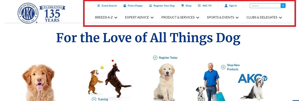
Usually directly below the HEADER is the NAVIGATION MENU. Some website have a vertical menu on the left side. Occasionally there will be a secondary menu below the main menu or at the bottom of the page.
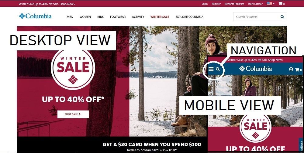
On a phone or tablet, the menu will often be replaced by 3 horizontal lines. When you click on that, you'll see a vertical menu. Good thing because the menu links can seem pretty small on old websites. (NOTE: You can see these lines labeled 'Navigation' in the Columbia image above)
As a side note, the newer websites are called 'responsive' because they respond to the size of the user's device. If you're on a laptop or bigger device, you can grab the side of your browser window and drag it to make the window smaller. A responsive website will change right before your eyes. The older websites that aren’t responsive or mobile-friendly can be very hard to see and even harder to navigate on a phone.
Continuing down, the next part you'll see is the BODY or CONTENT AREA. Sometimes it's just text. Sometimes it also has images. Sometimes it's one large area and other times it's broken into smaller blocks. This is where the main content for that page goes. By the way, each page should focus on one idea or theme. For example, if you have a stud dog you should have one main page about just that dog. You might have a page that shows all your dogs with links to individual dog's pages or you might have a secondary page that shows the dog's puppies, but there should be one page that highlights each dog.
In the text there are often links that guide users to more information. Some links are 'external' in that they go to a different website while others are 'internal' and direct users to other pages within the same website.
There may also be a SIDEBAR. Sometimes it's on the left, but more often it's on the right when you're browsing on a computer. On a phone or tablet, that 'sidebar' will usually move below the main content. You may not even notice that it's a different type of content when you're browsing on a phone.
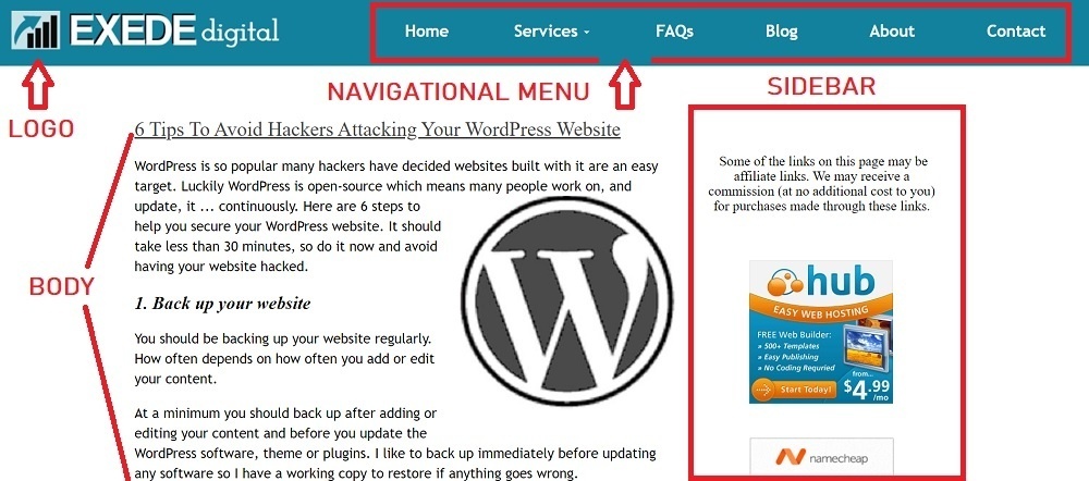
Often the SIDEBAR will have an opt-in form, a call to action such as 'Request a quote' or 'Contact Us' plus links to popular posts, social media links and maybe a brief 'About us' section. Each website might use the section a bit differently, but usually it will be the same throughout the website or a portion of the website.
At the bottom of the page is the FOOTER. Like the header, they can be very simple - just the copyright notice - or they can include everything but the kitchen sink. The best websites fall somewhere in between. They might include basic contact information (or a 'contact us' form), social media icons, additional secondary links (such as to a Privacy Policy), a search box, a small map or whatever information would be helpful. Usually the footer remains the same throughout the website.
The Parts Of A Website You Can't See Or Barely Notice
Let's start with the website's URL ('Uniform Resource Locator'). Just like every building has a street address, every website has a URL.
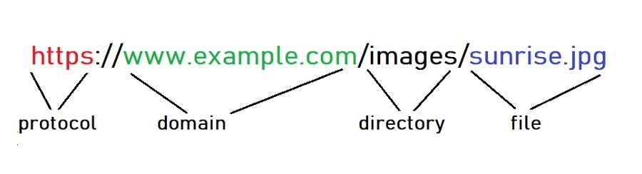
Most start with 'http://' (or 'https://' for a secure connection). This is the protocol or rules about how data is transferred over the internet.
Next is the domain name - www.example.com - for the website you want to visit. Special computers convert those words into a series of numbers called the 'IP address' and then send your request to the computer at that address.
That computer then looks in the directory - images - and finds the file - sunrise.jpg - then sends it to your computer or phone to display.
Another part you can't see is the website CODE. These are instructions telling your browser what to display.
Here’s how to view the code:
On a PC running the Chrome browser -
- Right-click the page.
- Click View page source.
- The source code will show in a new tab in the browser.
On a Mac running Safari -
- Click on Safari menu > Preferences > Advanced.
- Check "Show Develop menu in menu bar".
- Close the Preferences window.
- Go to the Develop menu > Show Page Source.
On an Android running Chrome -
- Open the Google Chrome Internet browser.
- Open the web page.
- Tap once in the address bar and then move the cursor to the front of the URL.
- Type view-source: and press Enter or Go.
On an iPhone/iPad running Safari -
- Go to Settings > Safari and check 'Enable Web Inspector'
- Open up Safari and go to the page you want to inspect
- Plug your device into your computer and open up Safari on your desktop.
- Go to Develop > Your iPad/iPhone Device > the tab you want to inspect.
That code is quite a bit more sophisticated than plain HTML that I wrote in Notepad to build websites many years ago. If you'd like to try using HTML to make a simple page showing a table, go to Add A 3-Generation Pedigree Table To Your Website.
By the way, there are other little bits of code that websites use to learn more about you when you visit. They're called PIXELS and COOKIES.
Pixels allow a third party to track user behavior. Say you're thinking about buying a BMW car and visit their website to see what's available, then the next day your Facebook page is showing you ads for BMWs. That's because you triggered a pixel on the BMW website. (Just an example. I don't know whether BMW uses pixels or not.)
Cookies store information in your browser so the server can read it later. For example, the first time you used Facebook you had to provide information such as a user name and a password, but you don't have to do that anymore. That's because the Facebook website reads the cookie in your browser and knows it's you so you don't have to remember all your login information. Although it can seem somewhat intrusive at times, neither collect personally identifiable information.
Now you know a bit more about websites and the internet. You can even speak 'web design.' Let me know if you have any questions.

Some of the links on this page may be affiliate links. We may receive a commission (at no additional cost to you) for purchases made through these links.