![]()
With the popularity of smart phones, most consumers are going online to find businesses that suit their needs.
And 75% of those consumers are going to make a decision – usually within a few seconds – about whether your business can meet their needs.
Do you know what they’re using to base their decision?
Your web design.
The color, the layout, the use of white space all factor into a quick, subconscious decision whether to stick around long enough to read your text.
Surprised?
Let’s take a look to see what might cause those consumers to bounce right off your website like a beach ball at a concert.
What Do Users See First?
Eye tracking studies show there are certain places visitors scan first – usually across the top and down the left side. Then, if it interests them, they will skim more of the page and click on content that catches their attention.
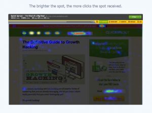
Image courtesy CrazyEgg.com
Where most people look when they first visit your website, is exactly where YOU should put your most important message and images.
And don’t be coy or cute. Visitors aren’t going to stick around to figure out what you mean. Make it clear what your website is about.
Action Steps:
Open your most important pages, one at a time. Now squint. What do you see? If the important information doesn’t jump out at you, you need to update your page. Place that information in the hot spot areas and make it stand out.
Be sure to check out Crazy Egg and also try the Five Second Test to see how real people evaluate your website – in the first few seconds.
Does Your Website Look Outdated?
Does your website still have a visitor counter or guestbook? Does it need a splash screen? Does it use Flash?
These features may have been fun or useful 20 years ago, but now they just make your website look outdated or even amateurish. And they may negatively affect user experience.
Hopefully there aren’t any websites that still use blinking text in rainbow colors or mouse trails. Neither were fun or useful.
Here are more reasons some websites suck:
- green text on a black background,
- few, if any, links after leaving the home page,
- huge picture file sizes,
- pages that take forever to load,
- having to scroll sideways,
- having to scroll down and down and down and down,
- typos,
- audio and/or video that starts automatically,
- poor content.
Action Steps:
Update your website with a fresh, clean look.
Avoid placing text over an image or textured background. Also avoid using a reverse color scheme where there is a dark background and light text. It’s usually more important that visitors are able to read your text easily than it is to look too trendy.
Use plenty of white space to give your content some ‘breathing’ room. Break up your paragraphs into 1 or 2 sentences each. Add images and other graphics to add interest and convey your message more clearly.
Choose an easy-to-read font with sufficient size. Twelve pixels is about the smallest size to use and still be readable on a variety of screens. Avoid most curly, script and odd fonts because they can be hard to read. One exception might be to use one of these types of fonts as a design element in your logo.
Check the size of your images. Unless it’s a featured image, it shouldn’t be more than 800-1000 pixels on the long side. Most PC computers come with a free program called ‘Paint’ that can help you crop or just resize overly large images.
Don’t try to do everything on one page. Break your content into reasonable chunks and make use of categories and subcategories. For example, a roofing company might have links to Home, Commercial Roofing, Residential Roofing, About Us and Contact Us. Then there could be subcategories for specific types of roofs and/or service areas.
And make sure your website doesn’t have any of the sucky problems listed above!
Is Your Website Mobile-Friendly?
Because so many people browse the web using a mobile device, an old, static website is going to be difficult – or even impossible – for them to see.
If you get them to visit and they have a poor experience, they won’t come back.
Ever.
Some problems visitors might encounter on a website that isn’t mobile-friendly are:
- Having to pinch and zoom to read text,
- having to tap on links that are too-small on mobile devices,
- slow load times,
- videos that don't play on mobile devices (Flash is particularly bad).
Google has been pushing for mobile-friendly websites since 2013 and made it a part of their algorithm in April 2015. Websites that are not mobile-friendly rank poorly in mobile searches. And because so many people are using their mobile devices to access the Internet, they may never find your website.
Action Steps:
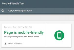
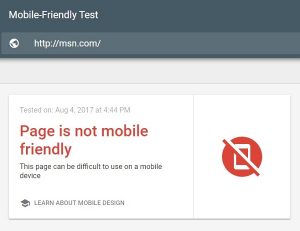
Use Google’s Mobile-Friendly test to check your website. Be sure to test your home page AND any other important pages. Sometimes the home page will pass because it doesn’t have much text, which could mislead you to think that your entire website is fine.
If your website doesn’t pass, is it worth trying to update it using old technology or should you ditch that old, static website? Remember, your advertising dollars are wasted if you’re sending potential customers to an outdated, not-mobile-friendly website.
If your website is huge and it’s not cost effective to change right now, consider updating the front page and then set up a separate mobile-only website. This website will have just the basic information a visitor needs – what you sell, where you’re located, how to get in touch with you, etc. It’s the façade of your business. Once you have this mobile-only site, you need to link it to more information on your old website.
In all other cases, build a new, mobile-friendly website. I’d suggest a responsive design because it will show well no matter what size screen your visitors use. It automatically recognizes the type of device used to view it, then rearranges and resizes itself to provide a good experience for visitors. It’s also Google’s preferred format.
What Makes A Good Website?
So your website is well-designed, looks up-to-date and is mobile-friendly, but it may still fail if you haven’t designed it for your targeted customer.
If you were shopping for a new luxury car, would you trust a website that looks and sounds like it was designed by a teenager?
Probably not.
Take a look at your website. Would the graphics and content appeal to your targeted audience? If not, you should redesign it.
Action Steps:
Start by asking your current customers what they would like to see on your website.
Look for online forums where your ideal customers hang out and check for the questions they’re asking. Make sure your content answers those questions.
When someone visits your home page, make it clear what they should do next. You could give them a choice, but no more than 3 or 4 so it doesn’t get confusing for them.
Write your content at – or slightly below – the education level of your target audience. Don’t talk down to them, but make it easy to read.
Include a call-to-action on every page. Call now for a quote. Sign up for our newsletter. Visit one of our locations today.
Can Visitors Find Your Website?
Some people think it’s enough to have a website, but it won’t do any good if no one sees it. There are over a BILLION websites on the web, so you need to do some extra work to make sure your customers and potential customers can find you.
Some common misconceptions about search results:
- Search results are alphabetized. No, they’re not. Google looks at 200 factors about every website to find the best answer to the user’s search terms. If you were the only dentist in Anytown (population: 100), you would probably show up at the top of the search results for ‘dentist in Anytown.’ But what if your practice is located in a town where there are 30 dentists, plus 20 more in the surrounding towns? Just got a little tougher, didn’t it?
- People know my website address, so I don’t need to do any of that SEO mumbo-jumbo. It’s great that your customers are aware of your address, but don’t you want new customers too? People are using Google Search to find what they want and if your website isn’t optimized to rank high in the search results, they’re probably going to go to your competition.
- I don’t have to do anything because my website is already at the top of page 2. Unfortunately you probably won’t get much - if any - traffic from the search results because 91% of searchers NEVER go beyond page 1 and over half of searchers will never look past the top 3 results.
- My website is in the top 3 for my search terms, so I don’t have to do anything more. Awesome! But what about other key words potential customers might use? Whatever you sell, there’s sure to be several ways people might describe it.
- My home page already has hundreds of search terms. I don’t need to add any more. Unless your home page is humongous, it shouldn’t have hundreds of key words. Your home page should act as an introduction to your business and a sign post to more information. There should be separate pages for each of your major key words so if a visitor is searching for ‘blue widgets’, he doesn’t have to wade through information about ‘green widgets’ and ‘red widgets’ and ‘rainbow-colored widgets.’
You know who else is checking out your web design? Google and other search engines are using new technology to decide whether a site looks good or not. It may not be a factor in your search rankings – yet – but it’s definitely something to consider.
Action steps:
Decide which key words you want to use in your website. Each page should be different – similar, but different.
If it’s got too much competition, you might try some other key words or consider using long-tail keywords. For example, if you sell computers instead of trying to rank for ‘laptops for sale’ niche it down to ‘Dell Inspiron 5000 laptop for sale.’ It is more targeted and will have less competition.
If you service a local area, use the name of your area (and maybe surrounding areas too) in your key words. For example, ‘plumber serving Denver CO.’ Another page could use ‘plumber in Parker CO.’
Once you’ve decided on your key words, use them on that page. Include them in the title, in the first paragraph and in the ALT tag on a graphic.
You can also use words that would be found naturally with your key words. For example, a plumber might also use words and phrases like ‘stopped up drain’ or ‘broken pipe.’
Provide quality information and don’t overdo the use of your keywords. Your text should sound natural if you were to read it out loud. Also make sure the text is relevant to your key words. Your visitors won’t be happy if they go to your page expecting to find information about one thing, but your text is about something different.
There is a LOT to Search Engine Optimization. Much more than we can put in short actions steps, but using key words properly will get you started. Be watching our website for a complete update of our post Complete Beginner’s Guide to SEO. It will be available in a couple of weeks.
Thanks for reading! I hope this post has helped you decide whether your website is working. And if not, what you need to do to make it better.
If you decide to do-it-yourself or ‘hire’ your neighbor’s kid, it needs to be done right. Sometimes DIY works just fine, but unless you are familiar with all the recent updates available you may need another redesign soon.
Or you could go with a ‘do-it-for-me’ website design professional who will make sure it’s done right the first time.
Remember your website is one of your best sales tools. Make sure you keep it up-dated, optimized and looking good!
Contact us now to find out about getting your new professional website.
Some of the links on this page may be affiliate links. We may receive a commission (at no additional cost to you) for purchases made through these links.